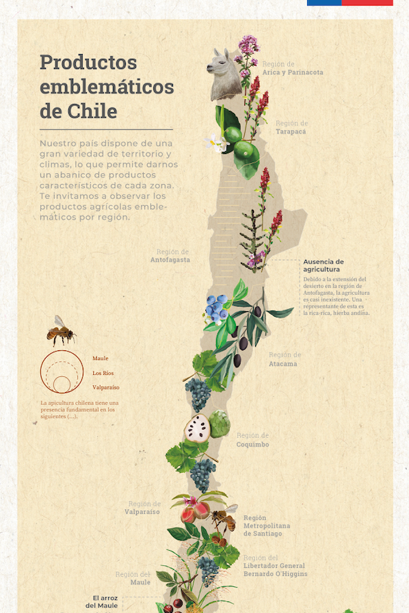
Infographics for the Office of Agricultural Policies and Studies, Ministry of Agriculture of Chile
.
During my time as a designer at the Ministry of Agriculture, I focused on introducing a new visual language to public service: infographics. One of the main challenges was bringing a new visual language into a highly traditional environment — public administration, where flexibility and communication innovation are often harder to implement. Designing new ways to convey information within those constraints was a significant part of the work. Here are some examples produced during that period.

Process — working within the Chilean public sector
Designing inside a government institution means working within layers of process that a private studio or newsroom rarely has: every piece needs sign-off from communications, technical staff, and often the head of the department before it can go out, and each round of approval can reshape the brief.
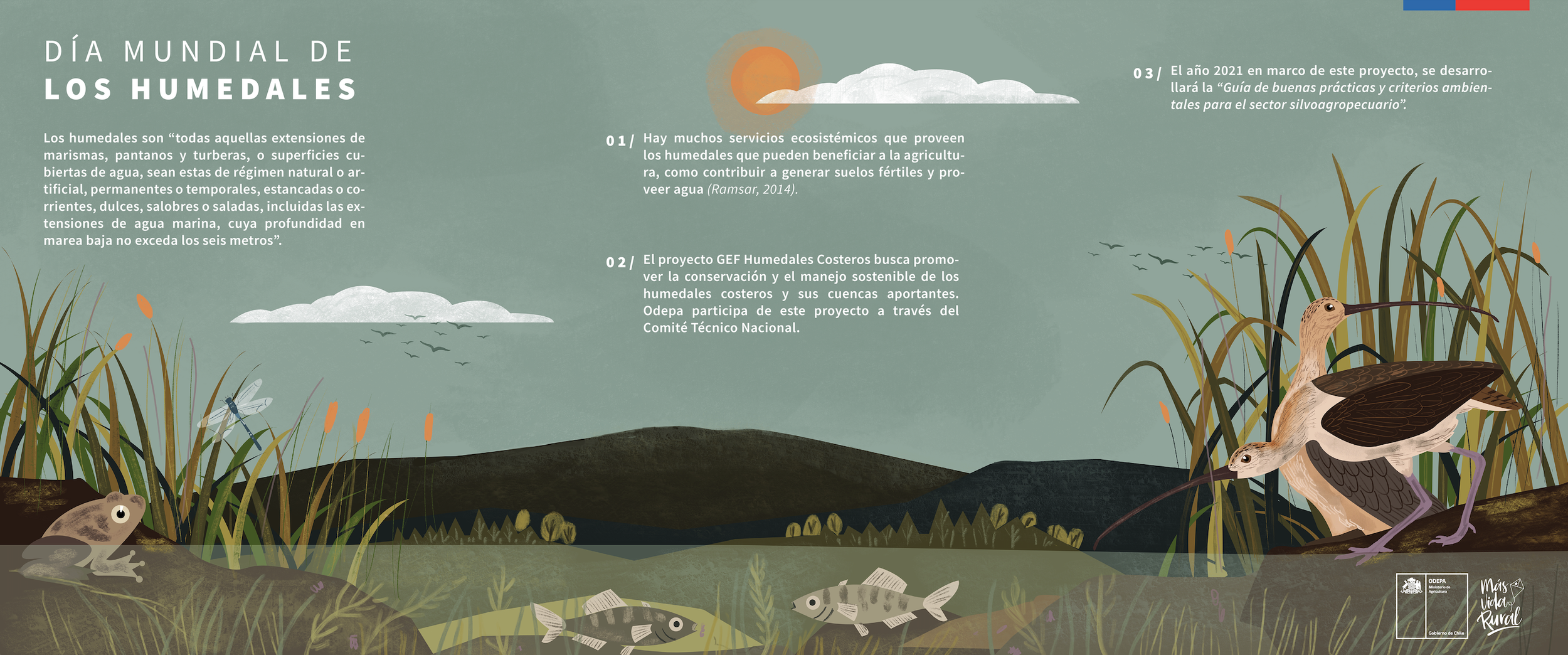

Content also had to be technically accurate to the standards of agricultural policy experts while still being legible to the general public — a balance that required constant back-and-forth translation between specialist language and visual clarity.
Introducing infographics as a new format meant not just designing the pieces themselves, but making the case, again and again, for why a visual approach served the ministry's communication goals better than the text-only formats already in use.